Chapter 24 Doing more with ggplot2
Throughout this block we have learnt a range of ways to plot our data using ggplot2. Here we provide a few more examples of ways you may wish to customise your plots. You will not be examined on the material in this chapter, however it will be helpful when you have to make plots for other modules, such as during your Level 1 projects.
We will use the storms data set again from the nasaweather package. As in the Relationships between two variables chapter we will reorder the levels of the type variable so that they get increasingly fierce.
# 1. make a vector of storm type names in the required order
storm_names <- c("Tropical Depression", "Extratropical", "Tropical Storm", "Hurricane")
# 2. now convert type to a factor
storms_alter <-
  storms %>%
  mutate(type = factor(type, levels = storm_names))
24.1 Adding error bars
In the Building in Complexity chapter we learnt how to make a bar chart showing the means of our data. However, we generally want to show how variable the data are as well as the central tendency (e.g. mean) of the data. To do this we can include error bars showing for example the standard deviation or standard error of the mean. We’ll demonstrate this using the storms data set again, by plotting the means and standard errors of wind speed for each storm type.
We start by calculating the means and standard deviations for each group.
storms_sum <-
  storms_alter %>%
  group_by(type) %>%
  summarise(mean_wind = mean(wind), std = sd(wind))
storms_sum
## # A tibble: 4 x 3
## type mean_wind std
## <fct> <dbl> <dbl>
## 1 Tropical Depression 27.4 3.52
## 2 Extratropical 40.1 13.2
## 3 Tropical Storm 47.3 11.1
## 4 Hurricane 84.7 18.8We can now use this data frame to make the plot, using geom_col to plot the means and the unsurprisingly named geom_errorbar to add the error bars.
ggplot(storms_sum, aes(x=type, y = mean_wind)) +
  # Plot the means
  geom_col(fill = "orange") +
  # Add the error bars
  geom_errorbar(aes(ymin = mean_wind - std, ymax = mean_wind + std), width = 0.1) +
  # Flip the axes round to prevent labels overlapping
  coord_flip() +
  # Use a more professional theme
  theme_classic(base_size = 12) +
  # Change the axes labels
  xlab("Storm Category") + ylab("Mean Wind Speed (mph)")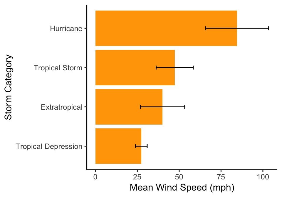
The ymin and ymax arguments of the geom_errorbar function give the lower and upper limits of error bars. Here, we have plotted the mean +/- 1 standard deviation. Note that we can change the width of the error bars using the width argument. Also remember if you’re including error bars on a plot that you MUST specify in the figure legend what they show (e.g. standard deviation, standard error of the mean, 95% confidence intervals).
24.2 Adding text to plots
There may be some cases in which you want to add text to plots, for example to show the sample size for each group or to show which categories are significantly different from each other if you’ve performed a statistical test (we’ll come back to this at Level 2).
Here we’re going to add a label for each bar on our bar chart. To do this we start by adding the labels that we want to use to the data frame. For example, here we will calculate the mean (using the mean function) and the sample size (using the function n) for each group.
storms_sum <-
  storms %>%
  group_by(type) %>%
  summarise(mean_wind = mean(wind), samp = n())
storms_sum
## # A tibble: 4 x 3
## type mean_wind samp
## <chr> <dbl> <int>
## 1 Extratropical 40.1 412
## 2 Hurricane 84.7 896
## 3 Tropical Depression 27.4 513
## 4 Tropical Storm 47.3 926Then we can add the text showing the sample size to our plot using the function geom_text.
ggplot(storms_sum, aes(x = type, y = mean_wind)) +
 # Add the bars
 geom_col(fill = "orange") +
 # Flip the axes round
 coord_flip() +
 # Change the axes labels
 xlab("Storm Category") + ylab("Mean Wind Speed (mph)") +
 # Add the text
 geom_text(aes(label = samp, y = 10)) +
 # Use a more professional theme
 theme_classic(base_size = 12)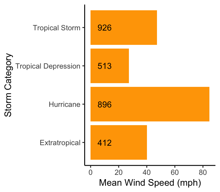
24.3 Customising text
Sometimes we may want to change the appearance of the text on the plot. For example, sometimes if the axis labels are quite long they may be bunched together or overlap each other, making it difficult to read them. We saw this before in the Exploring Categorical Variables chapter.
ggplot(storms_alter, aes(x = type)) +
  geom_bar(fill = "orange", width = 0.7) +
  xlab("Storm Type") + ylab("Number of Observations")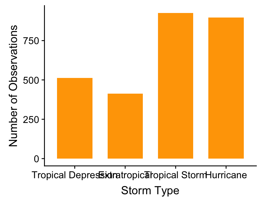
Here it is very difficult to read the categories on the \(x\) axis as the text is overlapping. In the Exploring Categorical Variables chapter we saw one way to deal with this, by using coord_flip to rotate the axes. An alternative to this is to change the size of text - a simple way to do this is to use the base_size argument within a ggplot theme_XX function as follows:
ggplot(storms, aes(x = type)) +
  geom_bar(fill = "orange", width = 0.7) +
  xlab("Storm Type") + ylab("Number of Observations") +
  theme_classic(base_size = 10)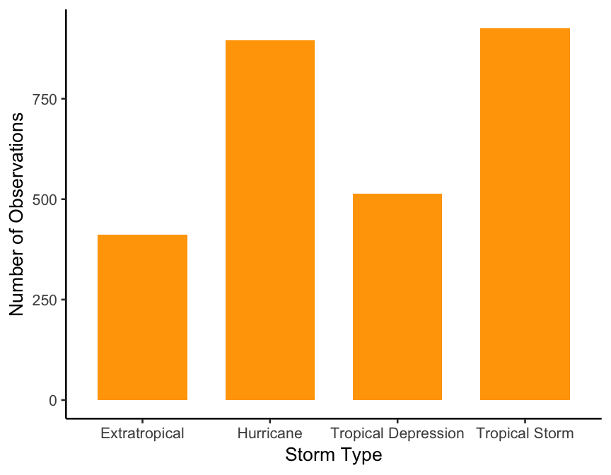
The base_size argument changes the size of all of the text within the plot.
It is also possible to rotate the labels themselves rather than the whole plot. Here, we use the angle argument of the element_text function again inside theme.
ggplot(storms, aes(x = type)) +
  geom_bar(fill = "orange", width = 0.7) +
  xlab("Storm Type") + ylab("Number of Observations") +
  theme(axis.text.x = element_text(angle = 90))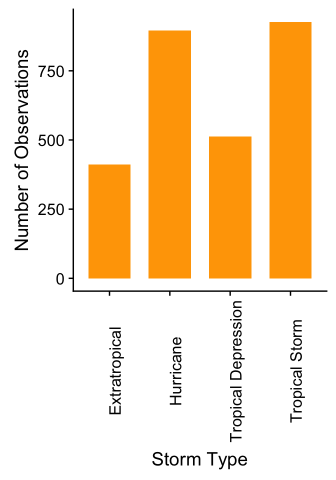
Here we used the argument ‘axis.text.x’ so that only the labels on the \(x\) axis were rotated.
24.4 Saving plots
When using RStudio plots can be saved using the Export button. However, such plots are often pixelated. R also has a range of functions that can be used to save plots. When making figures with ggplot we can use the ggsave function.
For example, here we will create a scatter plot using the storms data set again.
ggplot(storms, aes(x = pressure, y = wind)) +
  # Add the points
  geom_point() +
  # Change the axis labels
  labs(x="Atmospheric pressure (mbar)", y = "Wind speed (mph)")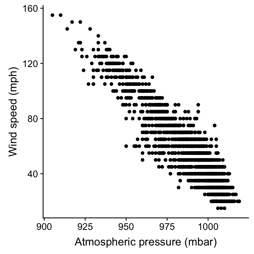
Once you’re happy with the plot you can use the ggsave function to save it as follows:
ggsave("Stormsplot.pdf", height = 5, width = 5)The first argument that this function takes is the name of the file that you will save. By default ggsave will save the last plot that you’ve made. You can also provide the name of a plot as the second argument to the function if you have assigned it a name. Note that R will save the plot to your working directory (you can change where the plot is saved to using the path argument in the ggsave function). Note that if you do not specify the width and height arguments to ggsave it will use the current size of your plotting window.
You can also add the ggsave function on to the code for a specific plot
ggplot(storms, aes(x = pressure, y = wind)) +
  # Add the points
  geom_point() +
  # Change the axis labels
  labs(x="Atmospheric pressure (mbar)", y = "Wind speed (mph)") +
  # Save the figure
  ggsave("Stormsplot.pdf", height = 5, width = 5)
24.5 Panel plots
We have already seen how the facet_wrap function can be used to produce multiple panels in the Introduction to ggplot2 chapter. This function can be used where you want to make multiple plots each showing a different level of a factor. However, sometimes you may wish to present a multi-panel plot using different variables in the different panels.
There are multiple ways to do this, we’re going to show you one using the cowplot package. First make sure that this package is installed (if you haven’t used it before) and loaded (every time you use it). Then make the individual plots that you want to include your multi-panel plot using ggplot as normal. For example we might want to look at a) the relative frequency of different storm types occuring and b) the mean wind speed associated with each storm type. First we make these two plots that we want to include in the panel and assign these to names.
plta <- ggplot(storms, aes(x = type)) +
  geom_bar(fill = "orange") +
  xlab("Storm Type") + ylab("Number of Observations") +
  theme_classic(base_size = 10)

pltb <- ggplot(storms_sum, aes(x=type, y = mean_wind)) +
  # Plot the means
  geom_col(fill = "orange") +
  # Change the axes labels
  xlab("Storm Category") + ylab("Mean Wind Speed (mph)") +
  theme_classic(base_size = 10)
Then we can use the plot_grid function from the cowplot package to create the multi-panel plot.
plot_grid(plta, pltb, nrow = 1, labels = c("auto"), label_size = 10)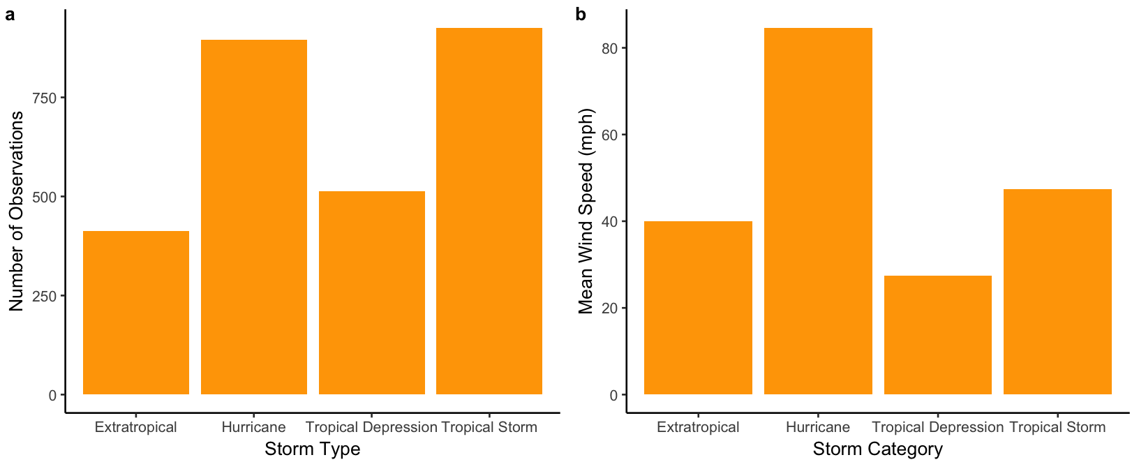
The plot_grid function allows the panel to be customised easily, for example by changing the number of plots in each row (nrow argument) and including labels for each panel (labels argument).
We can then use the ggsave function to save our multi-panel plot as before.
# Create the multi-panel plot
plot_grid(plta, pltb, nrow = 1, labels = c("auto"), label_size = 10) +
  # Save it
  ggsave("Stormsplot.pdf", height = 4, width = 8)