Chapter 14 A correlation test
We’re going to consider ‘correlation’ in this chapter. A correlation is a statistical measure of an association between two variables. An association is any relationship between the variables that makes them dependent in some way: knowing the value of one variable gives you information about the possible values of the other.
The terms ‘association’ and ‘correlation’ are often used interchangeably but strictly speaking correlation has a narrower definition. A correlation quantifies, via a measure called a correlation coefficient, the degree to which an association tends to a certain pattern. For example, the correlation coefficient studied below—Pearson’s correlation coefficient—measures the degree to which two variables tend toward a straight line relationship.
There are different methods for quantifying correlation but these all share a number of properties:
- If there is no relationship between the variables the correlation coefficient will be zero. The closer to 0 the value, the weaker the relationship. A perfect correlation will be either -1 or +1, depending on the direction. This is illustrated in the figure below:
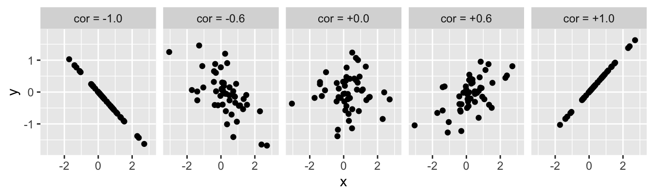
The value of a correlation coefficient indicates the direction and strength of the association but says nothing about the steepness of the relationship. A correlation coefficient is just a number, so it can’t tell us exactly how one variable depends on the other.
Correlation coefficients do not describe ‘directional’ or ‘casual’ relationships—i.e. we can’t use correlations to make predictions about one variable based on knowledge of another or make statements about the effect of one variable on the other.
A correlation coefficient doesn’t tell us whether an association is likely to be ‘real’ or not. We have to use a statistical significance test to evaluate whether a correlation may be different from zero. Like any statistical test, this requires certain assumptions about the variables to be met.
We’re going to make sense of all this by studying one particular correlation coefficient in this chapter: Pearson’s product-moment correlation coefficient (\(r\)). Various different measures of association exist so why focus on this one? Well… once you know how to work with one type of correlation in R it isn’t hard to use another. Pearson’s product-moment correlation coefficient is the most well-known, which means it is as good a place as any to start learning about correlation analysis.
14.1 Pearson’s product-moment correlation
What do we need to know about Pearson’s product-moment correlation? Let’s start with the naming conventions. People often use “Pearson’s correlation coefficient” or “Pearson’s correlation” as a convenient shorthand because writing “Pearson’s product-moment correlation coefficient” all the time soon becomes tedious. If we want to be really concise we use the standard mathematical symbol to denote Pearson’s correlation coefficient—lower case ‘\(r\).’
The one thing we absolutely have to know about Pearson’s correlation coefficient is that it is a measure of linear association between numeric variables. This means Pearson’s correlation is appropriate when numeric variables follow a ‘straight-line’ relationship. That doesn’t mean they have to be perfectly related, by the way. It simply means there shouldn’t be any ‘curviness’ to their pattern of association5.
Finally, calculating Pearson’s correlation coefficient serves to estimate the strength of an association. An estimate can’t tell us whether that association is likely to be ‘real’ or not. We need a statistical test to tackle that question. There is a standard parametric test associated with Pearson’s correlation coefficient. Unfortunately, this does not have its own name. We will call it “Pearson’s correlation test” to distinguish the test from the actual correlation coefficient. Just keep in mind these are not ‘official’ names.
14.1.1 Pearson’s correlation test
The logic underpinning Pearson’s correlation test is the same as we’ve seen in previous tests: define a null hypothesis, calculate an appropriate test statistic, work out the null distribution of that statistic, and then use this to calculate a p-value from the observed coefficient. We won’t work through the details other than to note a few important aspects:
When working with Pearson’s correlation coefficient the ‘no effect’ null hypothesis corresponds to one of zero (linear) association between the two variables (\(r=0\)).
The test statistic associated with \(r\) turns out to be a t-statistic. This has nothing to do with comparing means—t-statistics pop up all the time in frequentist statistics.
Like any parametric technique, Pearson’s correlation test makes a number of assumptions. These need to be met in order for the statistical test to be reliable. The assumptions are:
Both variables are measured on an interval or ratio scale.
The two variables are normally distributed (in the population).
The relationship between the variables is linear.
The first two requirements should not need any further explanation at this point—we’ve seen them before in the context of the one- and two-sample t-tests. The third one obviously stems from Pearson’s correlation coefficient being a measure of linear association.
Only the linearity assumption needs to be met for Pearson’s correlation coefficient (\(r\)) to be a valid measure of association. As long as the relationship between two variables is linear, \(r\) produces a sensible measure of association. However, the first two assumptions need to be met for the associated statistical test to be appropriate.
That’s enough background and abstract concepts. Let’s see how to perform correlation analysis in R using Pearson’s correlation coefficient.
14.2 Pearson’s product-moment correlation coefficient in R
Work through the example in this section. We’ll be using a new data set ‘BRACKEN.CSV’ here so you shuold start a new script. Everything below assumes the data in ‘BRACKEN.CSV’ has been read into an R data frame with the name bracken.
The plant morph example is not suitable for correlation analysis. We need a new example to motivate a work flow for correlation tests in R. The example we’re going use is about the association between ferns and heather…
Bracken fern (Pteridium aquilinum) is a common plant in many upland areas. A land manager need to know whether there is any association between bracken and heather (Calluna vulgaris) in these areas. To determine whether the two species are associated, she sampled 22 plots at random and estimated the density of bracken and heather in each plot. The data are the mean Calluna standing crop (g m-2) and the number of bracken fronds per m2.
14.2.1 Visualising the data and checking the assumptions
The data are in the file BRACKEN.CSV. Read these data into a data frame, calling it bracken:
bracken <- read_csv("BRACKEN.CSV")glimpse(bracken)## Rows: 22
## Columns: 2
## $ Calluna <dbl> 980, 760, 613, 489, 498, 416, 589, 510, 459, 680, 471, 145, 2…
## $ Bracken <dbl> 2.3, 1.4, 4.0, 3.6, 4.3, 4.0, 6.3, 6.5, 8.3, 8.2, 8.1, 9.1, 8…There are 22 observations (rows) and two variables (columns) in this data set. The two variables, Calluna and Bracken, contain the estimates of heather and bracken abundance in each plot, respectively.
We should always explore the data thoroughly before carrying out any kind of statistical analysis. To begin, we can visualise the form of the association with a scatter plot:
ggplot(bracken, aes(x = Calluna, y = Bracken)) +
  geom_point()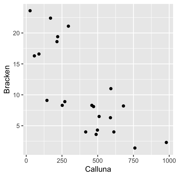
There appears to be a strong negative association between the species’ abundances, and the relationship seems to follow a ‘straight line’ pattern. It looks like Pearson’s correlation is a reasonable measure of association for these data.
We will confirm this with a significance test. Is it appropriate to carry out the test? We’re dealing with numeric variables measured in ratio scale (assumption 1). What about their distributions (assumptions 2)? Here’s a quick visual summary:
ggplot(bracken, aes(x = Calluna)) + geom_dotplot(binwidth = 100)
ggplot(bracken, aes(x = Bracken)) + geom_dotplot(binwidth = 2)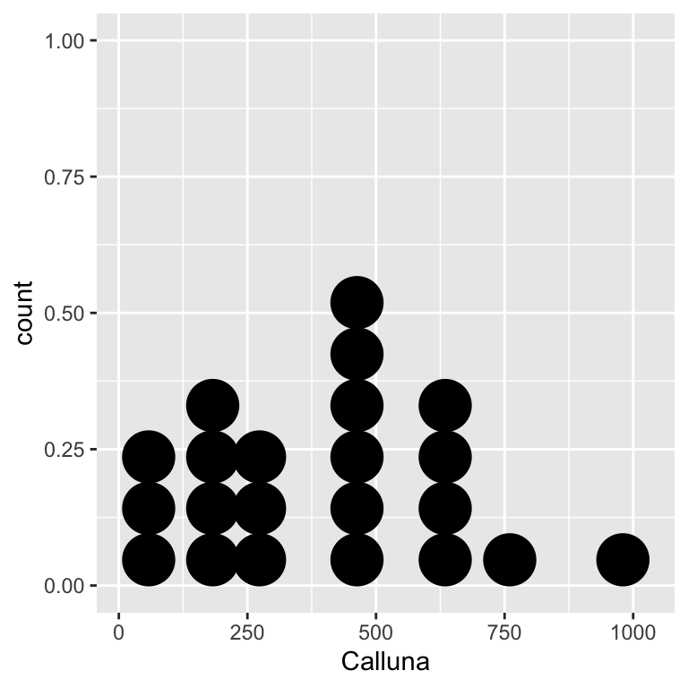
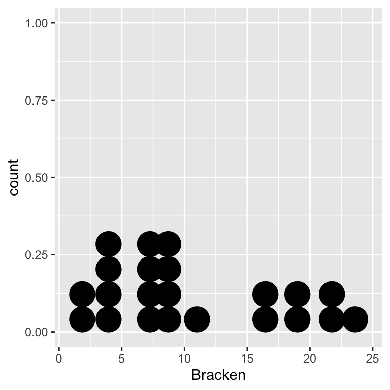
These dot plots suggest the normality assumption is met, i.e. both distributions are roughly ‘bell-shaped.’
That’s all three assumptions met—the variables are on a ratio scale, dot the normality assumption is met, and the abundance relationship is linear. It looks like the statistical test will give reliable results.
14.2.2 Doing the test
Let’s proceed with the analysis… Carrying out a correlation analysis in R is straightforward. We use the cor.test function to do this:
cor.test(~ Calluna + Bracken, method = "pearson", data = bracken)We have suppressed the output for now to focus on how the function works:
We use the R formula syntax to determine which pair of variables are analysed. The
cor.testfunction expects the two variable names to appear to the right of the~, separated by a+symbol, with nothing on the left.We use
method = "pearson"to control which type of correlation coefficient was calculated. The default method is Pearson’s correlation but it never hurts to be explicit which is why we wrotemethod = "pearson"anyway.When we use the formula syntax, as we are doing here, we have to tell the function where to find the variables. That’s the
data = brackenpart.
Notice cor.test uses a different convention from the t.test function for the formula argument of. t.test places one variable on the left and the other variable on the right hand side of the ~ (e.g. Calluna ~ Bracken), whereas cor.test requires both two variables appear to the right of the ~, separated by a + symbol. This convention exists to emphasise the absence of ‘directionality’ in correlations, i.e. neither variable has a special status. This will probably make more sense after we talk about ‘regression’ in the next couple of chapters.
The output from the cor.test is, however, very similar to that produced by the t.test function. Here it is:
##
##  Pearson's product-moment correlation
##
## data:  Calluna and Bracken
## t = -5.2706, df = 20, p-value = 3.701e-05
## alternative hypothesis: true correlation is not equal to 0
## 95 percent confidence interval:
##  -0.8960509 -0.5024069
## sample estimates:
##        cor
## -0.7625028
We won’t step through most of this as its meaning should be clear. The t = -5.2706, df = 20, p-value = 3.701e-05 line is the one we really care about:
The first part says that the test statistic associated with the test is a t-statistic, where
t = -5.27. Remember, this has nothing to do with ‘comparing means.’Next we see the degrees of freedom for the test. Can you see where this comes from? It is \(n-2\), where \(n\) is the sample size. Together, the degrees of freedom and the t-statistic determine the p-value…
The t-statistic and associated p-value are generated under the null hypothesis of zero correlation (\(r = 0\)). Since p < 0.05, we conclude that there is a statistically significant correlation between bracken and heather.
What is the actual correlation between bracken and heather densities? That’s given at the bottom of the test output: \(-0.76\). As expected from the scatter plot, there is quite a strong negative association between bracken and heather densities.
14.2.3 Reporting the result
When using Pearson’s method we report the value of the correlation coefficient, the sample size, and the p-value6. Here’s how to report the results of this analysis:
There is a negative correlation between bracken and heather among the study plots (r=-0.76, n=22, p < 0.001).
14.3 Next steps
Notice that when we summarised the result we did not say that bracken is having a negative effect on the heather, or vice versa. It might well be true that bracken has a negative effect on heather. However, our correlation analysis only characterises the association between bracken and heather7. If we want to make statements about one species is related to the other we need use a different kind of analysis. That’s the focus of our next topic: regression.
If non-linear associations are apparent it’s generally better to use a different correlation coefficient (we’ll consider one alternative later in the book).↩︎
People occasionally report the value of the correlation coefficient, the t-statistic, the degrees of freedom, and the p-value. We won’t do this.↩︎
There is a second subtler limitation to this analysis: it was conducted using data from an observational study. If we want to say something about how bracken affects heather then we have to conduct an experimental manipulation (e.g. removing bracken from some plots).↩︎