Chapter 18 One-way ANOVA in R
18.1 Introduction
Our goal in this chapter is to learn how to work with one-way ANOVA models in R. Just as we did with regression, we’ll do this by working through an example. We’ll start with the problem and the data, and then work through model fitting, significance testing, and finally, presenting the results.
Before we can do this though, we need to side track a bit and learn about ‘factors’ in R…
Walk through
You should begin working through the corn crake example from this point. You will need to download the CORN_CRAKE.CSV file from MOLE and place it in your working directory.
18.2 Factors in R
Remember factors? An experimental factor is a controlled variable whose levels (‘values’) are set by the experimenter. R is primarily designed to carry out data analysis so we shouldn’t be surprised that it has a special type of vector to represent factors. This kind of vector in R is called, rather sensibly, a factor. We have largely ignored factors in R up until now because we haven’t needed to use them11. However, we now need to understand how they work because much of R’s plotting and statistical modelling facilities rely on factors.
We’ll look at the corn crake data (stored in corn_crake) to begin
getting a sense of how they work:
corn_crake <- read.csv(file = "CORN_CRAKE.CSV")First, we need to be able to actually recognise a factor when we see
one. Here is the result of using glimpse with the diet data:
glimpse(corn_crake)## Rows: 40
## Columns: 2
## $ Supplement <chr> "None", "None", "None", "None", "None", "None", "None", "N…
## $ WeightGain <int> 13, 20, 17, 16, 15, 14, 10, 20, 15, 18, 10, 22, 23, 19, 25…This tells us that there are 40 observations in the
data set and 2 variables (columns), called
Supplement and WeightGain. The text next to $ Supplement says
<fctr>. We can guess what that stands for…. it is telling us that
the Supplement vector inside corn_crake is a factor. The
Supplement factor was created automatically when we read the data
stored in CORN_CRAKE.CSV into R. When we read in a column of data that
is non-numeric, read.csv will often decide to turn it into a factor
for us12.
R is generally fairly good at alerting us to the fact that a variable is
stored as a factor. For example, look what happens if we extract the
Supplement column from corn_crake and print it to the screen:
corn_crake$Supplement## [1] "None" "None" "None" "None" "None" "None"
## [7] "None" "None" "Sizefast" "Sizefast" "Sizefast" "Sizefast"
## [13] "Sizefast" "Sizefast" "Sizefast" "Sizefast" "Linseed" "Linseed"
## [19] "Linseed" "Linseed" "Linseed" "Linseed" "Linseed" "Linseed"
## [25] "Allvit" "Allvit" "Allvit" "Allvit" "Allvit" "Allvit"
## [31] "Allvit" "Allvit" "Earlybird" "Earlybird" "Earlybird" "Earlybird"
## [37] "Earlybird" "Earlybird" "Earlybird" "Earlybird"This obviously prints out the values of each element of the vector, but look at the last line:
## Levels:This alerts us to the fact that Supplement is a factor, with
0 levels (the different
supplements). Look at the order of the levels: these are alphabetical by
default. Remember that! The order of the levels in a factor can be
important as it controls the order of plotting in ggplot2 and it
affects the way R presents the summaries of statistics. This is why we
are introducing factors now—we are going to need to manipulate the
levels of factors to alter the way our data are plotted and analysed.
18.3 Visualising the data
As always before we fit a model we should plot our data. We can do this using a boxplot.
ggplot(corn_crake, aes(x = Supplement, y = WeightGain)) +
  geom_boxplot()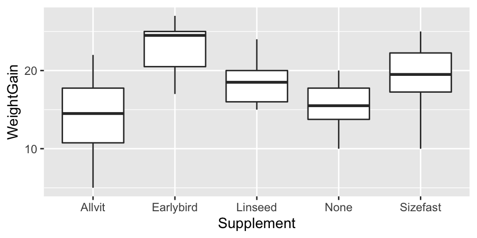
At this point we just want to get an idea of what our data look like. We don’t need to worry about customising the plot to make it look nicer.
Examine the plot
Have a look at the plot and think about what it means biologically e.g. which supplement seems to have had the biggest effect? Do all of the supplements increase growth relative to the control?
18.4 Fitting the ANOVA model
Carrying out ANOVA in R is quite simple, but as with regression, there is more than one step. The first involves a process known as fitting the model (or just model fitting). This is the step where R calculates the relevant means, along with the additional information needed to generate the results in step two. We call this step model fitting because an ANOVA is a type of model for our data: it is a model that allows the mean of a variable to vary among groups.
How do we fit an ANOVA model in R? We will do it using the lm function
again. Remember what the letters ‘lm’ stand for? They stand for
‘(general) linear model.’ So… an ANOVA model is just another special
case of the general linear model. Here is how we fit a one-way ANOVA in
R, using the corncrake data:
corncrake_model <- lm(WeightGain ~ Supplement, data = corn_crake)Hopefully by now this kind of thing is starting to look familiar. We have to assign two arguments:
The first argument is a formula. We know this because it includes a ‘tilde’ symbol:
~. The variable name on the left of the~must be the numeric response variable whose means we want to compare among groups. The variable on the right should be the indicator (or predictor) variable that says which group each observation belongs to. These areWeightGainandSupplement, respectively.The second argument is the name of the data frame that contains the two variables listed in the formula.
Why does R carry out ANOVA?
How does R know we want to use an ANOVA model? After all, we didn’t specify this anywhere. The answer is that R looks at what type of vector Supplement is. It is a factor, and so R automatically carries out an ANOVA. It would do the same if Supplement had been a character vector. However, if the levels of Supplement had been stored as numbers (1, 2, 3, …) then R would not have fitted an ANOVA. We’ve already seen what would have happened. It would have assumed we meant to fit a regression model. This is why we don’t store categorical variables as numbers in R. Avoid using numbers to encode the levels of a factor, or any kind of categorical variable, if you want to avoid making mistakes in R.
Notice that we did not print the results to the console. Instead, we
assigned the result a name —corncrake_model now refers to a model
object. What happens if we print this to the console?
corncrake_model##
## Call:
## lm(formula = WeightGain ~ Supplement, data = corn_crake)
##
## Coefficients:
## (Intercept) SupplementEarlybird SupplementLinseed
## 14.250 8.625 4.250
## SupplementNone SupplementSizefast
## 1.375 4.750Not a great deal. Printing a fitted model object to the console is not very useful when working with ANOVA. We just see a summary of the model we fitted and some information about the coefficients of the model. Yes, an ANOVA model has coefficients, just like a regression does.
Assumptions
The one-way ANOVA model has a series of assumptions about how the data are generated. This point in the workflow would be a good place to evaluate whether or not these may have been violated. However, we’re going to tackle this later in the Assumptions and Diagnostics chapters. For now it is enough to be aware that there are assumptions associated with one-way ANOVA, and that you should evaluate these when working with your own data.
18.5 Interpreting the results
What we really want is a p-value to help us determine whether there is statistical support for a difference among the group means. That is, we need to calculate things like degrees of freedom, sums of squares, mean squares, and the F-ratio. This is step 2.
We use the anova function to do this:
anova(corncrake_model)## Analysis of Variance Table
##
## Response: WeightGain
##            Df Sum Sq Mean Sq F value   Pr(>F)
## Supplement  4 357.65  89.413  5.1281 0.002331 **
## Residuals  35 610.25  17.436
## ---
## Signif. codes: 0 '***' 0.001 '**' 0.01 '*' 0.05 '.' 0.1 ' ' 1Notice that all we did was pass the anova function one argument: the
name of the fitted model object. Let’s step through the output to see
what it means. The first line just informs us that we are looking at an
ANOVA table, i.e. a table of statistical results from an analysis of
variance. The second line just reminds us what variable we analysed.
The important information is in the table that follows:
## Df Sum Sq Mean Sq F value Pr(>F)
## Supplement 4 357.65 89.413 5.1281 0.002331 **
## Residuals 35 610.25 17.436This is an Analysis of Variance Table. It summarises the parts of the
ANOVA calculation: Df – degrees of freedom, Sum Sq – the sum of
squares, Mean Sq – the mean square, F value – the F-ratio (i.e.
variance ratio), Pr(>F) – the p-value.
The F-ratio (variance ratio) is the key term. This is the test statistic. It provides a measure of how large and consistent the differences between the means of the five different treatments are. Larger values indicate clearer differences between means, in just the same way that large values of Student’s t indicate clearer differences between means in the two sample situation.
The p-value gives the probability that the observed differences between the means, or a more extreme difference, could have arisen through sampling variation under the null hypothesis. What is the null hypothesis: it is one of no effect of treatment, i.e. the null hypothesis is that all the means are the same. As always, the p-value of 0.05 is used as the significance threshold, and we take p < 0.05 as evidence that at least one of the treatments is having an effect. For the corncrake data, the value is 5.1, and the probability (p) of getting an F-ratio this large is given by R as 0.0023, i.e. less than 0.05. This provides good evidence that there are differences in weight gain between at least some of the treatments.
So far so good. The test that we have just carried out is called the global test of significance. It goes by this name because it doesn’t tell us anything about which means are different. The analyses suggest that there is an effect of supplement on weight gain, but some uncertainty remains because we have only established that there are differences among at least some supplements. A global test doesn’t say which supplements are better or worse. This could be very important. If the significant result is generated by all supplements being equally effective (hence differing from the control but not from each other) we would draw very different conclusions than if the result was a consequence of one supplement being very effective and all the others being useless. Our result could even be produced by the supplements all being less effective than the control!
So having got a significant result in the ANOVA, we should always look at the means of the treatments to understand where the differences actually lie. We did this in the previous chapter but here is the figure again anyway:
## `summarise()` ungrouping output (override with `.groups` argument)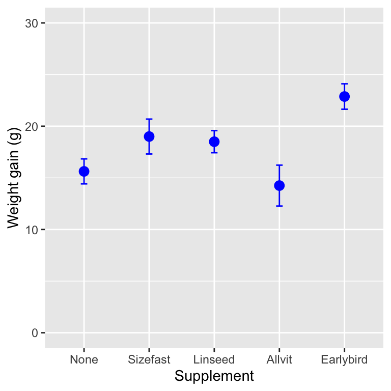
What looking at the means tells us is that the effect of the supplements is generally to increase weight gain (with one exception, ‘Allvit’) relative to the control group (‘None’), and that it looks as though ‘Earlybird’ is the most effective, followed by ‘Sizefast’ and ‘Linseed.’
Often inspection of the means in this way will tell us all we need to know and no further work will be required. However, sometimes it is desirable to have a more rigorous way of testing where the significant differences between treatments occur. A number of tests exist as ‘add ons’ to ANOVA which enable you to do this. These are called post hoc multiple comparison tests (sometimes just ‘multiple comparison tests’). We’ll see how to conduct these in the Multiple comparison tests chapter.
18.6 Summarising and presenting the results of ANOVA
As with all tests it will usually be necessary to summarise the result from the test in a written form. With an ANOVA on several treatments, we always need to at least summarise the results of the global test of significance, for example:
There was a significant effect of supplement on the weight gain of the corncrake hatchlings (ANOVA: F=5.1; d.f.= 4,35; p<0.01).
There are several things to notice here:
The degrees of freedom are always quoted as part of the result, and…there are two values for the degrees of freedom to report in ANOVA because it involves F-ratios. These are obtained from the ANOVA table and should be given as the treatment degrees of freedom first, followed by the error degrees of freedom. Order matters. Don’t mix it up.
The degrees of freedom are important because, like a t-statistic, the significance of an F-ratio depends on the degrees of freedom, and giving them helps the reader to judge the result you are presenting. A large value may not be very significant if the sample size is small, a smaller may be highly significant if the sample sizes are large.
The F-ratio rarely needs to be quoted to more than one decimal place.
When it comes to presenting the results in a report, it helps to present the means, as the statement above cannot entirely capture the results. We could use a table to do this, but tables are ugly and difficult to interpret. A good figure is much better.
You won’t be assessed on your ability to produce summary plots such as those below. Nonetheless, you should try to learn how to make them because you will need to produce these kinds of figures in your own projects.
Box and whiskers plots and multi-panel dot plots / histograms are exploratory data analysis tools. We use them at the beginning of an analysis to understand the data, but we don’t tend to present them in project reports or scientific papers. Since ANOVA is designed to compare means, a minimal plot needs to show the point estimates of each group-specific mean, along with a measure of their uncertainty. We often use the standard error of the means to summarise this uncertainty.
In order to be able to plot these quantities we first have to calculate
them. We can do this using dplyr. Here’s a reminder of the equation
for the standard error of a mean: \[
SE = \frac{\text{Standard deviation of the sample}}{\sqrt{\text{Sample size}}} = \frac{SD}{\sqrt{n}}
\] So, the required dplyr code is:
# get the mean and the SE for each supplement
corncrake_stats <-
  corn_crake %>%
  group_by(Supplement) %>%
  summarise(Mean = mean(WeightGain), SE = sd(WeightGain)/sqrt(n()))
## `summarise()` ungrouping output (override with `.groups` argument)# print to the console
corncrake_stats## # A tibble: 5 x 3
## Supplement Mean SE
## <chr> <dbl> <dbl>
## 1 Allvit 14.2 1.98
## 2 Earlybird 22.9 1.23
## 3 Linseed 18.5 1.07
## 4 None 15.6 1.21
## 5 Sizefast 19 1.69Notice that we used the n function to get the sample size. The rest of
this R code should be quite familiar by now. We gave the data frame
containing the group-specific means and standard errors the name
corncrake_stats.
We have a couple of different options for making a good summary figure.
The first plots a point for each mean and places error bars around this
to show ±1 SE. In order to do this using ggplot2 we have to add two
layers—the first specifies the points (the means) and the second
specifies the error bar (the SE). Here is how to do this:
ggplot(data = corncrake_stats,
       aes(x = Supplement, y = Mean, ymin = Mean - SE, ymax = Mean + SE)) +
  # this adds the means
  geom_point(colour = "blue", size = 3) +
  # this adds the error bars
  geom_errorbar(width = 0.1, colour = "blue") +
  # controlling the appearance
  scale_y_continuous(limits = c(0, 30)) +
  # use sensible labels
  xlab("Supplement treatment") + ylab("Weight gain (g)") +
  # flip x and y axes
  coord_flip() +
  # use a more professional theme
  theme_bw()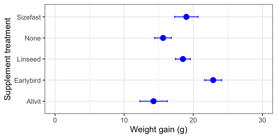
First, notice that we set the data argument in ggplot to be the data
frame containing the summary statistics (not the original raw data).
Second, we set up four aesthetic mappings: x, y, ymin and ymax.
Third, we added one layer using geom_point. This adds the individual
points based on the x and y mappings. Fourth, we added a second
layer using geom_errorbar. This adds the error bars based on the x,
ymin and ymax mappings. Finally we adjusted the y limits and the
labels (this last step is optional). Ask a demonstrator to step through
this with you if you are confused by it.
Take a close look at that last figure. Is there anything wrong with it?
The control group in this study is the no diet group (‘None’).
Conventionally, we display the control groups first. R hasn’t done this
because the levels of Supplement are in alphabetical order by default.
If we want to change the order of plotting, we have to change the way
the levels are organised. Here is how to to this using dplyr and a
function called factor:
corncrake_stats <-
  corncrake_stats %>%
  mutate(Supplement = factor(Supplement, levels = c("None", "Sizefast", "Linseed", "Allvit", "Earlybird")))
We use mutate to update Supplement, using the factor function to
redefine the levels of Supplement and overwrite the original. Now,
when we rerun the ggplot2 code we end up with a figure like this:
The treatments are presented in the order specified with the levels
argument. Problem solved!
A bar plot is another popular visualisation for summarising the results
of an ANOVA. We only have to change one thing about the last chunk of
ggplot2 code to make a bar plot. Instead of using geom_point, we use
geom_col (we’ll drop the coord_flip bit too):
ggplot(data = corncrake_stats,
       aes(x = Supplement, y = Mean, ymin = Mean - SE, ymax = Mean + SE)) +
  # this adds the means
  geom_col(fill = "lightgrey", colour = "grey") +
  # this adds the error bars
  geom_errorbar(width = 0.1, colour = "black") +
  # controlling the appearance
  scale_y_continuous(limits = c(0, 30)) +
  # use sensible labels
  xlab("Supplement treatment") + ylab("Weight gain (g)") +
  # use a more professional theme
  theme_bw()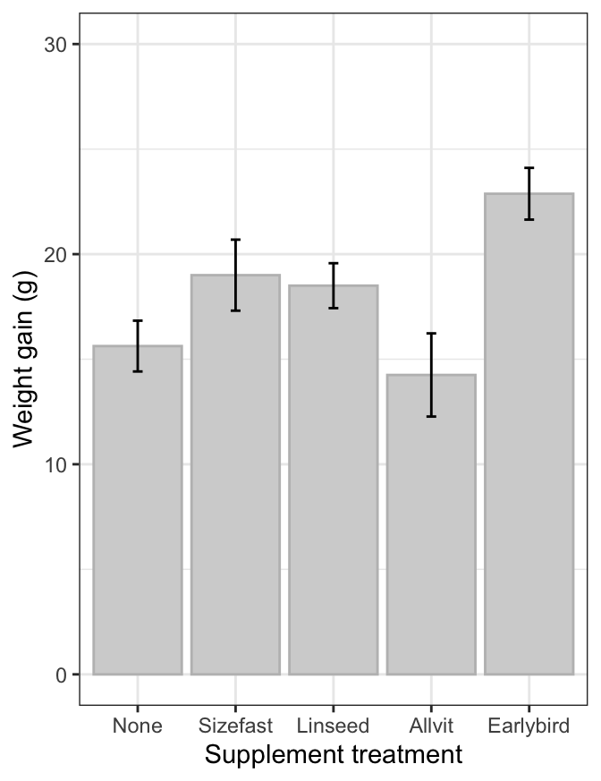
We have worked with factors, but only when reordering the labels of a categorical variable plotted in
ggplot2.↩︎This behaviour isn’t really all that helpful. It would be better if R let us, the users, decide whether or not to turn something into a factor vector. However, in the early days of R computers had limited memory, which meant storing a categorical variable as a factor made sense; it saved memory. This benefit of factors has long since disappeared, but we’re stuck with the turn-everything-into-a-factor behaviour.↩︎