Chapter 15 Relationships and regression
15.1 Introduction
Much of biology is concerned with relationships between numeric variables. For example…
We sample fish and measure their length and weight because we want to understand how weight scales with respect to length.
We survey grassland plots and measure soil pH and species diversity because we want to understand how species diversity depends on soil pH.
We manipulate temperature and measure fitness in insects because we want to characterise their thermal tolerance.
In the previous chapter we learnt about one technique for analysing associations between numeric variables (correlation). A correlation coefficient quantifies the strength and direction of an association between two variables. It will be close to zero if there is no association between the variables; a strong association is implied if the coefficient is near -1 or +1. A correlation coefficient tells us nothing about the form of a relationship. Nor does it allow us to make predictions about the value of one variable from the value of a second variable.
In contrast to correlation, a regression analysis does allow us to make precise statements about how one numeric variable depends on the values of another. Graphically, we can evaluate such dependencies using a scatter plot. We may be interested in knowing:
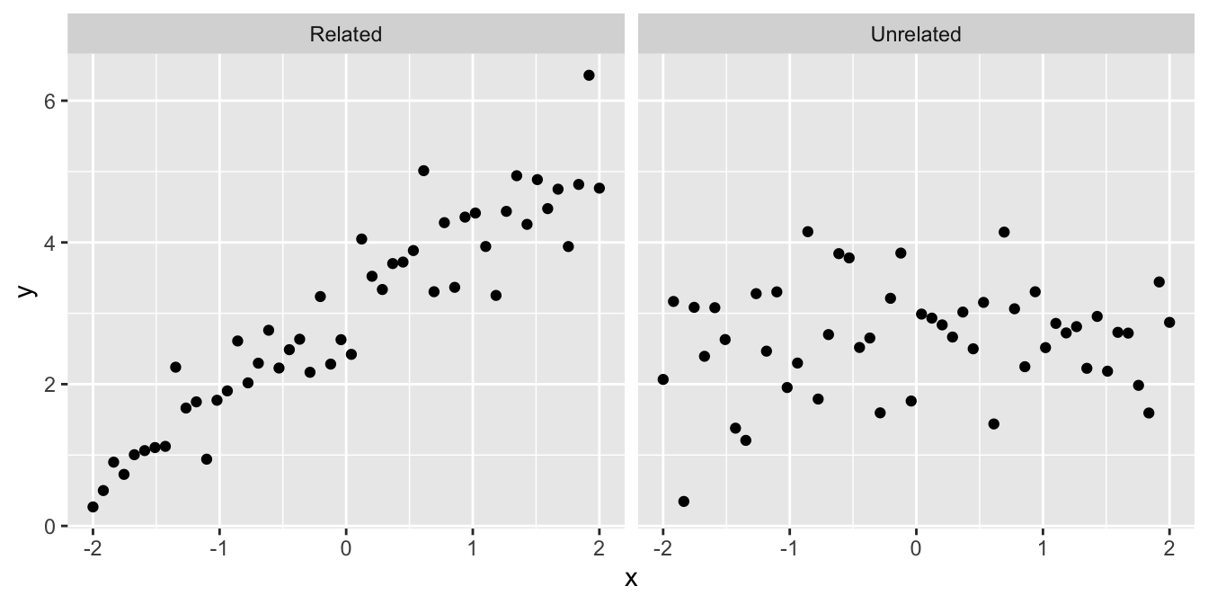
- Are the variables related or not? There’s not much point studying a relationship that isn’t there:
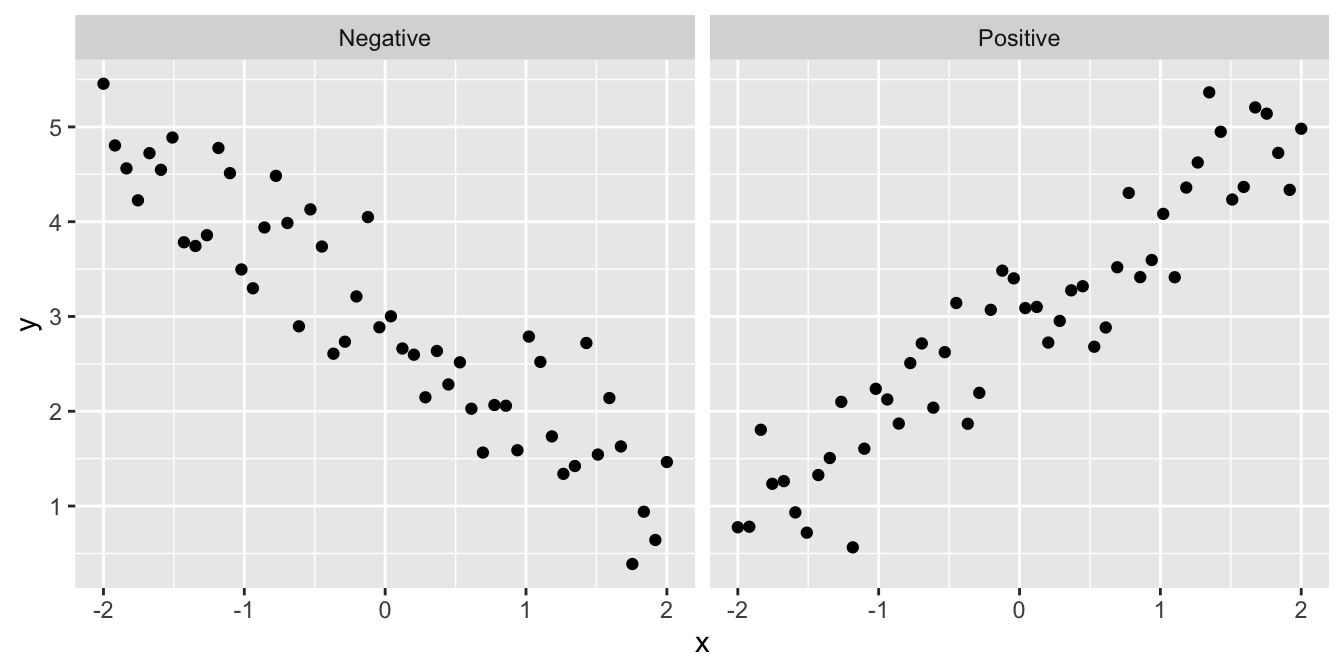
- Is the relationship positive or negative? Sometimes we can answer a scientific question just by knowing the direction of a relationship:
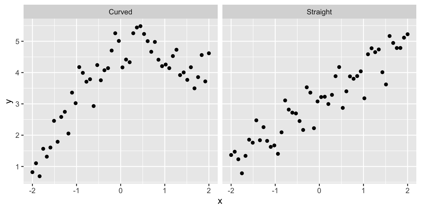
- Is the relationship a straight line or a curve? It is important to know the form of a relationship if we want to make predictions:
Although sometimes it may be obvious that there is a relationship between two variables from a plot of one against the other, at other times it may not. Take a look at the following:
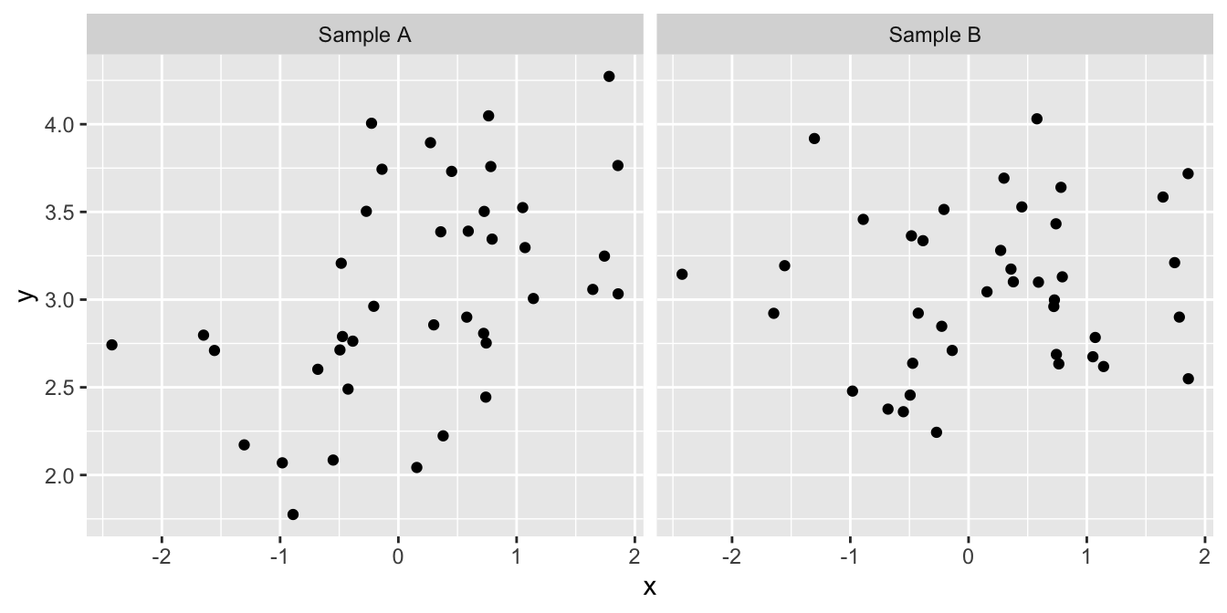
We might not be very confident in judging which, if either, of these plots provides evidence of a positive relationship between the two variables. Maybe the pattern that we perceive can just be explained by sampling variation, or maybe it can’t. We need a procedure—a statistical test—to evaluate how likely it is that the relationship could have arisen as a result of sampling variation. In addition to judging the statistical significance of a relationship, we may also be interested in describing the relationship mathematically – i.e. finding the equation of the best fitting line through the data.
A linear regression analysis allows us to do all this.
15.2 What does linear regression do?
Simple linear regression allows us to predict how one variable (called the response variable) responds or depends on to another (called the predictor variable), assuming a straight-line relationship.
What does the word ‘simple’ mean here? A simple linear regression is a regression model which only accounts for one predictor variable. If more than one predictor variable is considered, the correct term to describe the resulting model is ‘multiple regression.’ Multiple regression is a very useful tool but we’re only going to study simple regression in this book.
What does the word ‘linear’ mean here? In statistics, the word linear is used in two slightly different, but closely related ways. When discussing simple linear regression the term linear is often understood to mean that the relationship follows a straight line. That’s all. The more technical definition concerns the relationship between the parameters of a statistical model. We don’t need to worry about that one here.
Writing ‘simple linear regression’ all the time becomes tedious, so we’ll often write ‘linear regression’ or ‘regression.’ Just keep in mind that we’re always referring to simple linear regression in this book. These regression models account for a straight line relationship between two numeric variables, i.e. they describe how the response variable changes in response to the values of the predictor variable. It is conventional to label the response variable as ‘\(y\)’ and the predictor variable as ‘\(x\).’ When we present such data graphically, the response variable always goes on the \(y\)-axis and the predictor variable on the \(x\)-axis. Try not to forget this convention!
‘response vs. predictor’ or ‘dependent vs. independent?’
Another way to describe linear regression is that it finds the straight-line relationship which best describes the dependence of one variable (the dependent variable) on the other (the independent variable). The dependent vs. independent and response vs. predictor conventions for variables in a regression are essentially equivalent. They only differ in the nomenclature they use to describe the variables involved.
To avoid confusion, we will stick with response vs. predictor naming convention in this course.
How do we decide how to select which is to be used as the response variable and which as the predictor variable? The decision is fairly straightforward in an experimental setting: the manipulated variable is the predictor variable, and the measured outcome is the response variable. Consider the thermal tolerance example from earlier. Temperature was manipulated in that experiment, so it must be designated the predictor variable. Moreover, a priori (before conducting the experiment), we can reasonably suppose that changes in temperature may cause changes in enzyme activity, but the reverse seems pretty unlikely.
Things are not so clear cut when working with data from an observational study. Indeed, the ‘response vs. predictor’ naming convention can lead to confusion because the phrase ‘response variable’ tends to make people think in terms of causal relationships, i.e. that variation in the the predictor somehow causes changes in the response variable. Sometimes that is actually true, such as in the experimental setting described above. However, deciding to call one variable a response and the other a predictor should not be taken to automatically imply a casual relationship between them. We discuss this later in the section on causation and regression.
Finally, it matters which way round we designate the response and predictor variable in a regression analysis. If we have two variables A and B, the relationship we find from a regression will not be the same for A against B as for B against A. Choosing which variable to designate as the response boils down to working out which of the variables needs to be explained (response) in terms of the other (predictor).
15.3 How does simple linear regression work?
15.3.1 Finding the best fit line
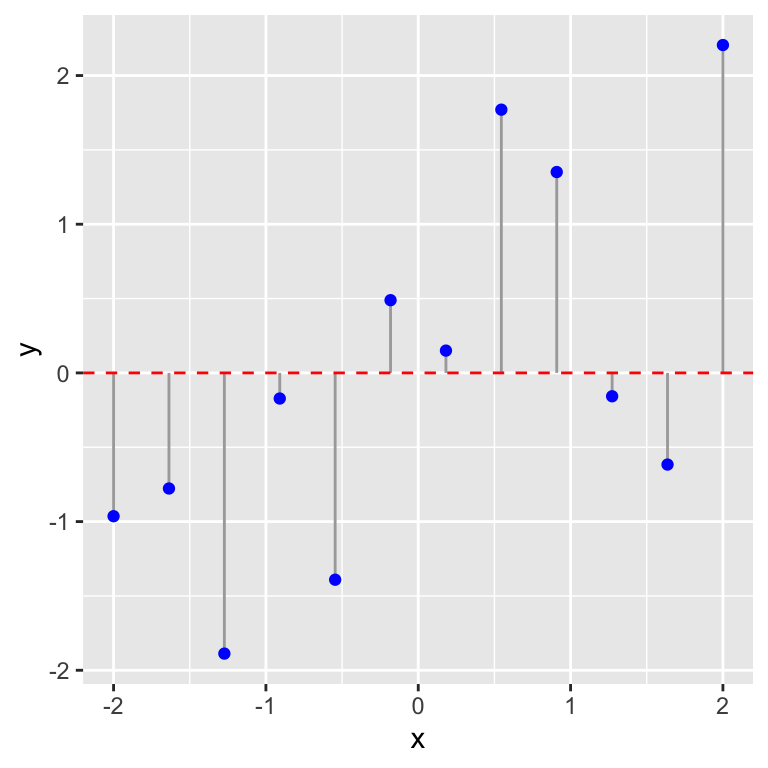
If we draw a straight line through a set of points on a graph then, unless they form a perfect straight line, some points will lie close to the line and others further away. The vertical distances between the line and each point (i.e. measured parallel to the \(y\)-axis) have a special name. They are called the residuals. Here’s a visual example:
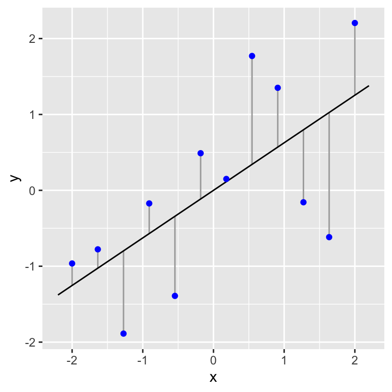
Figure 15.1: Example of data (blue points) used in a simple regression. A fitted line and the associated residuals (vertical lines) are also shown
In this plot the blue points are the data and the vertical lines represent the residuals. The residuals represent the variation that is ‘left over’ after the line has been fitted through the data. They give an indication of how well the line fits the data. If all the points lay close to the line the variability of the residuals would be low relative to the variation in the response variable, \(y\). When the observations are more scattered around the line the variability of the residuals would be large relative to the variation in the response variable, \(y\).
Regression works by finding the line which minimises the size of the residuals in some sense. We’ll explain exactly how in a moment. The following illustration indicates the principle of this process:
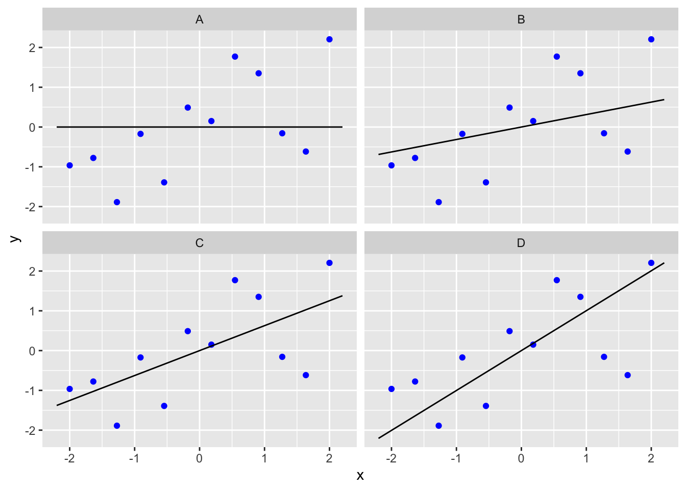
The data are identical in all four graphs, but in the top left hand graph a horizontal line (i.e. no effect of \(x\) on \(y\)) has been fitted, while on the remaining three graphs sloping lines of different magnitude have been fitted. To keep the example simple, we assume we know the true intercept of the line, which is at \(y=0\), so all four lines pass through \(x=0\), \(y=0\) (the ‘origin’).
Which line is best?
One of the four lines is the ‘line of best’ fit from a regression analysis. Spend a few moments looking at the four figures. Which line seems to fit the data best? Why do you think this line is ‘best?’
Let’s visualise the data, the candidate lines and the residuals:
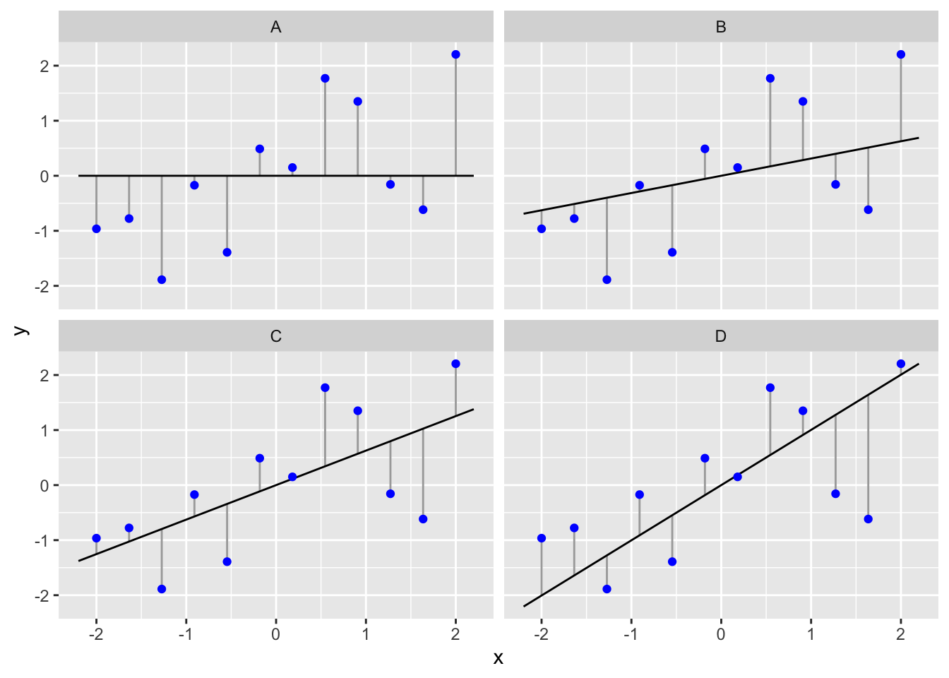
We said that regression works by finding the intercept and slope that minimises the vertical distances between the line and each observation in some way8. In fact, it minimises something called the ‘sum of squares’ of these distances: we calculate a sum of squares for a particular set of observations and a fitted line by squaring the residual distances and adding all of these up. This quantity is called the residual sum of squares. The line with the lowest residual sum of squares is the best line because it ‘explains’ the most variation in the response variable.
You should be able to see that, for the horizontal line (‘A’), the residual sum of squares is larger than any of the other three plots with the sloping lines. This suggests that the sloping lines fit the data better. Which one is best among the three we’ve plotted? To get at this we need to calculate the residual sum of squares for each line. These are…
##   Line    Residual Sum of Squares
## 1    A                   17.55067
## 2    B                   11.97966
## 3    C                   10.12265
## 4    D                   12.79674
So it looks like the line in panel C is the best fitting line among the candidates. In fact, it is the best fit line among all possible candidates. Did you manage to guess this by looking at the lines and the raw data? If not, think about why you got the answer wrong. Did you consider the vertical distances or the perpendicular distances?
It is very important that you understand what a residual from a regression represents. Residuals pop up all the time when evaluating statistical models (not just regression).
15.4 What do you get out of a regression?
A regression analysis involves two activities:
Interpretation. When we ‘fit’ a regression model to data we are estimating the coefficients of a best-fit straight line through the data. This is the equation that best describes how the \(y\) (response) variable responds to the \(x\) (predictor) variable. To put it in slightly more technical terms, it describes the \(y\) variable as a function of the \(x\) variable. This model may be used to understand how the variables are related or make predictions.
Inference. It is not enough to just estimate the regression equation. Before we can use it we need to determine whether there is a statistically significant relationship between the \(x\) and \(y\) variables. That is, the analysis will tell us whether an apparent association is likely to be real, or just a chance outcome resulting from sampling variation.
Let’s consider each of these two activities…
15.4.1 Interpreting a regression
What is the form of the relationship? The equation for a straight line relationship is \(y = a + b \times x\), where
\(y\) is the response variable,
\(x\) is the predictor variable,
\(a\) is the intercept (i.e. where the line crosses the \(y\) axis), and
\(b\) is the slope of the line.
The \(a\) and the \(b\) are referred to as the coefficients (or parameters) of the line. The slope of the line is often the coefficient we care about most. It tells us the amount by which \(y\) changes for a change of one unit in \(x\). If the value of \(b\) is positive (i.e. a plus sign in the above equation) this means the line slopes upwards to the right. A negative slope (\(y = a - bx\)) means the line slopes downwards to the right. The diagram below shows the derivation of an equation for a straight line.
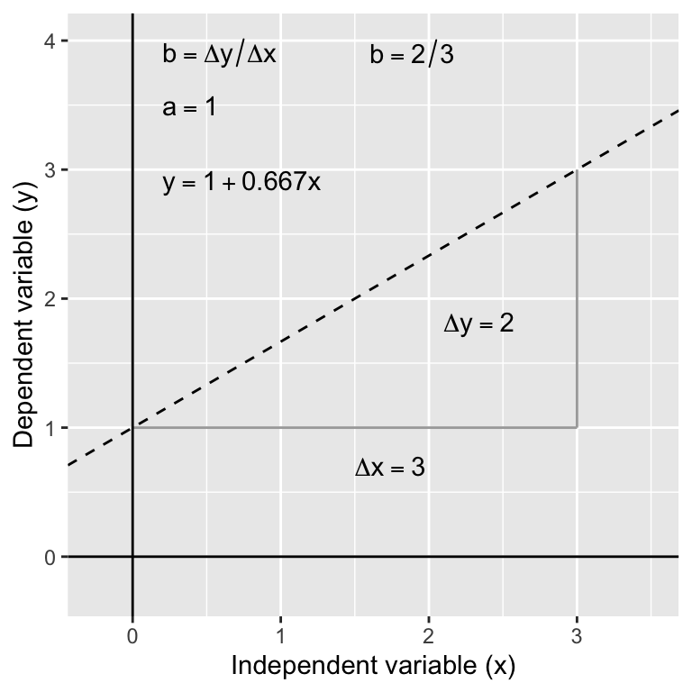
Having the equation for a relationship allows us to predict the value of the \(y\) variable for any value of \(x\). For example, in the thermal tolerance example, we want an equation that will allow us to work out how fitness changes with temperature. Such predictions can be made by hand (see below) or using R (details later).
In the above diagram, the regression equation is: \(y = 1 + 0.66 x\). So to find the value of \(y\) at \(x = 2\) we use: \(y = 1 + (0.667 \times 2) = 2.32\). Obviously, by finding \(y\) values for 2 (or preferably 3) different \(x\) values from the equation, the actual line can easily be plotted on a graph manually if required—plot the values and join the dots! It’s much easier to use R to do this kind of thing though.
Regression involves a statistical model
A simple linear regression is underpinned by a statistical model. If you skim back through the parametric statistics chapter you will see that the equation \(y = a + b \times x\) represents the ‘systematic component’ of the regression model. This bit describes the component of variation in \(y\) that is explained by the model for the dependence of \(y\) on \(x\). The residuals correspond to the ‘random component’ of the model. These represent the component of variation in the \(y\) variable that our regression model fails to describe.
15.4.2 Evaluating hypotheses (‘inference’)
There is more than one kind of significance test that can be carried out with a simple linear regression. We’re going to focus on the most useful test: the F test of whether the slope coefficient is significantly different from 0. How do we do this? We play exactly the same kind of ‘gambit’ we used to develop the earlier tests:
We start with a null hypothesis of ‘no effect.’ This corresponds to the hypothesis that the slope of the regression is zero.
We then work out what the distribution of some kind of test statistic should look like under the null hypothesis. The test statistic in this case is called the F-ratio.
We then calculate a p-value by asking how likely it is that we would see the observed test statistic, or a more extreme value, if the null hypothesis were really true.
It’s really not critical that you understand the mechanics of an F-test. However, there are several terms involved that are good to know about because having some sense of what they mean may help to demystify the output produced by R.
Let’s step through the calculations involved in the F test. We’ll use the example data shown in the four-panel plot from earlier to do this…
Total variation
First we need to calculate something called the total sum of squares. The figure below shows the raw data (blue points) and the grand mean (i.e. the sample mean).
The vertical lines show the distance between each observation and the grand mean. These vertical lines are just the residuals from a model where the slope of the line is set to zero. What we need to do is quantify the variability of these residuals. We can’t just add them up, because by definition, they have to sum to zero, i.e. they are calculated relative to the grand mean. Instead we calculate the total sum of squares by taking each residual in turn, squaring it, and then adding up all the squared values. We call this the total sum of squares because it is a measure of the total variability in the response variable, \(y\). This number is 17.55 for the data in the figure above.
Residual variation
Next we need to calculate the residual sum of squares. We have already seen how this calculation works because it is used in the calculation of the best fit line—the best fit line is the one that minimises the residual sum of squares. Let’s plot this line along with the associated residuals of this line again:

The vertical lines show the distance between each observation and the best fit line. We need to quantify the variability of these residuals. Again, we can’t just add up the deviations because they have to sum to zero as a result of how the best fit line is found. Instead we calculate the residual sum of squares by taking each residual in turn, squaring it, and then adding up all the squared values. This number is 10.12 for the figure above. We call this the residual, or error, sum of squares because it is a measure of the variation in \(y\) that is ‘left over’ after accounting for the influence of the predictor variable \(x\).
Explained variation
Once the total sum of squares and the residual sum of squares are known, we can calculate the quantity we really want: the explained sum of squares. This is a measure of the variation in \(y\) that is explained by the influence of the predictor variable \(x\). We calculate this by subtracting the residual sum of squares from the total sum of squares. This makes intuitive sense: if we subtract the variation in \(y\) we can’t explain (residual) from all the variation in \(y\) (total), we end up with the amount ‘explained’ by the regression. This number is 7.43 for the example.
Degrees of freedom, mean squares and F tests
The problem with sums of squares is that they are a function of sample size. The more data we have, the larger our sum of squares will get. The solution to this problem is to convert them into a measure of variability that doesn’t scale with sample size. We need to calculate degrees of freedom (written as df, or d.f.) to do this. We came across the concept of degrees of freedom when we studied the t-test. The idea is closely related to sample size. It is difficult to give a precise definition, but roughly speaking the degrees of freedom of a statistic is a measure of how much ‘information’ it contains.
Each of the measures of variability we just calculated for the simple linear regression has a degrees of freedom associated with it. We need the explained and error degrees of freedom:
Explained d.f. = 1
Error d.f. = (Number of observations - 2)
Don’t worry if those seem a little cryptic. We don’t need to carry out degrees of freedom calculations by hand because R will do them for us. We’ll think about degrees of freedom a bit more when we start to learn about ANOVA models.
The reason degrees of freedom matter is because we can use them to standardise the sum of squares to account for sample size. The calculations are very simple. We take each sum of squares and divide it by its associated degrees of freedom. The resulting quantity is called a mean square (it’s the mean of squared deviations): \[ \text{Mean Square} = \frac{\text{Sum of Squares}}{\text{Degrees of Freedom}} \] A mean square is actually an estimate of variance. Remember the variance? It is one of the standard measures of a distribution’s dispersion, or spread.
Now for the important bit. The two mean squares can be compared by calculating the ratio between them, which is designated by the letter F:
\[F = \mbox{Variance Ratio} = \frac{\mbox{Explained Mean Square}}{\mbox{Residual Mean Square}}\]
This is called the F ratio, or sometimes, the variance ratio. If the explained variation is large compared to the residual variation then the F ratio will be large. Conversely, if the explained variation is relatively small then F will be small. We can see where this is heading…
The F ratio is a type of test statistic—if the value of F is sufficiently large then we judge it to be statistically significant. In order for this judgement to be valid we have to make one key assumption about the population from which the data has been sampled: we assume the residuals are drawn from a normal distribution. If this assumption is correct, it can be shown that the distribution of the F ratio under the null hypothesis (the ‘null distribution’) has a particular form: it follows a theoretical distribution called an F-distribution. And yes, that’s why the variance ratio is called ‘F.’
All this means we can assess statistical significance of the slope coefficient by comparing the F ratio calculated from a sample to this theoretical distribution. This procedure is called an F test. The F ratio is 7.34 in our example. This is quite high which indicates that the slope is likely to be significantly different from 0. However, in order to actually calculate the p-value we also need to consider the degrees of freedom of the test, and because the test involves an F ratio, there are two different degrees of freedom to consider: the explained and residual df’s. Remember that!
We could go one to actually calculate the p-value, but it is much better to let R do this for us when we work directly with a regression model. We’ll leave significance tests alone for now…
15.5 Correlation or regression?
Before we finish up it is worth pausing to consider the difference between regression and correlation analyses. Whilst regression and correlation are both concerned with associations between numeric variables, they are different techniques and each is appropriate under distinct circumstances. This is a frequent source of confusion. Which technique is required for a particular analysis depends on
- the way the data were collected and
- the purpose of the analysis.
There are two broad questions to consider—
Where do the data come from?
Think about how the data have been collected. If they are from a study where one of the variables has been experimentally manipulated, then choosing the best analysis is easy. We should use a regression analysis, in which the predictor variable is the experimentally manipulated variable and the response variable is the measured outcome. The fitted line from a regression analysis describes how the outcome variable depends on the manipulated variable—it describes the causal relationship between them.
It is generally inappropriate to use correlation to analyse data from an experimental setting. A correlation analysis examines association but does not imply the dependence of one variable on another. Since there is no distinction of response or predictor variables, it doesn’t matter which way round we do a correlation. In fact, the phrase ‘which way round’ doesn’t even make sense in the context of a correlation.
If the data are from a so-called ‘observational study’ where someone took measurements but nothing was actually manipulated experimentally, then either method may be appropriate. Time to ask another question…
What is the goal of the analysis?
Think about what question is being asked. A correlation coefficient only quantifies the strength and direction of an association between variables—it tells us nothing about the form of a relationship. Nor does it allow us to make predictions about the value of one variable from the values of a second. A regression does allow this because it involves fitting a line through the data—i.e. regression involves a model for the relationship.
This means that if the goal is to understand the form of a relationship between two variables, or to use a fitted model to make predictions, we have to use regression. If we just want to know whether two variables are associated or not, the direction of the association, and whether the association is strong or weak, then a correlation analysis is sufficient. It is better to use a correlation analysis when the extra information produced by a regression is not needed, because the former will be simpler and potentially more robust.
Notice that it is the vertical distance that matters, not the perpendicular distance from the line.↩︎